Adobe Acrobat showing thick "L" and "I" characters
19-Mar-2020
If you you opened a PDF and you're seeing some characters looking slightly thicker or bolder, then this article will help you solve the problem.
It's a common problem when viewing PDF files on screen. The issue is created when typefaces are converted to objects or curves when a PDF is created. There is a simple solution, so read on to find out how you can easily resolve the problem. Only some letters or characters in the PDF proof appear thicker. Usually, this is the "L" or "I" character. For us, it's a common complaint heard from customers when they proof artwork with Acrobat PDF files.
How to solve thick letter L or I displaying in Acrobat PDF files
The display problem can be helped by making a simple change in your Adobe Acrobat Preferences.
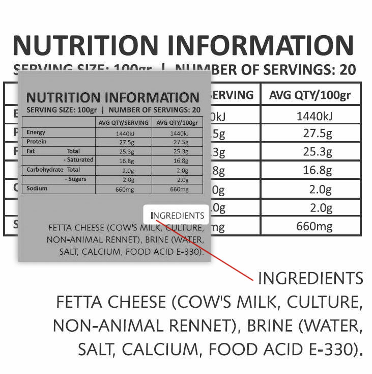
Additionally, another way to check your proof is to zoom into the proof (zoom further than 100%) you'll be able to see that the character is the correct thickness - the above image shows the "I" in the heading "INGREDIENTS" looking slightly bolder or thicker. The enlarged version (zoomed or magnified) of the same section of the image shows the "I" is not bolder at all.
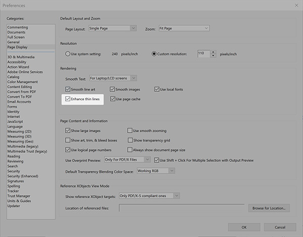
Adobe Acrobat Preference change
- From the Edit menu item on main toolbar, choose Preferences
- From the pop up window, Categories choose Page Display
- Under section "Rendering" untick the item "Enhance thin lines"
That's better!
Back to blog list⟶More reading
-
03-May-2023
Zero Waste Store
-
26-Apr-2023
Write helpful content for your website
-
05-Mar-2023
Privacy Law Compliance on your website
-
25-Aug-2022
.au domain names
-
21-Mar-2020
Free email signature template
-
09-Mar-2020
Local Citations for your business
-
01-Feb-2020
Designing for the top fold
-
13-Jan-2020
Adobe Business Catalyst End of Life